
Python Matplotlib
Python Matplotlib
知识点
1、什么是Matplotlib
Matplotlib 是一个 Python 2D 绘图库,可用于Python 脚本,Python 和 Python shell ,jupyter笔记本,web应用程序服务器和四个图形用户界面工具包。可绘成直方图,功率图,条形图,错误图,散点图等。
2、为什么学习Matplotlib
可视化数据,可以清晰的理解数据,从而调整我们的分析方法
- 能将数据进行可视化,更加直观的呈现
- 使数据更加客观,更具有说服力
3、常见的图形种类及意义
折线图:以折线的上升或者下降来表示统计流量的增减变化统计图
特点:能够显示数据的变化趋势,反映事物的变化情况
散点图:用两组数据构成多个坐标点,考察坐标点的分布,判断两变量之间是否存在某种关联或总结坐标点的分布模式。
特点:判断变量之间是否窜在数量关联趋势,展示分布规律
柱状图:排列在工作表的列或行中的数据可以绘制到柱状图中。
特点:绘制离散的数据,能够一眼看出各个数据的大小,比较数据之间的差别。
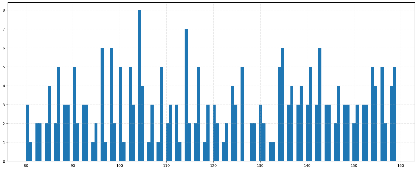
直方图:由一系列高度不等的纵向条纹或者线段表示数据的分布情况。一般用横轴表示数据范围,纵轴表示分布情况。
特点:绘制连续性的数据展示一组或者多组数据的分布
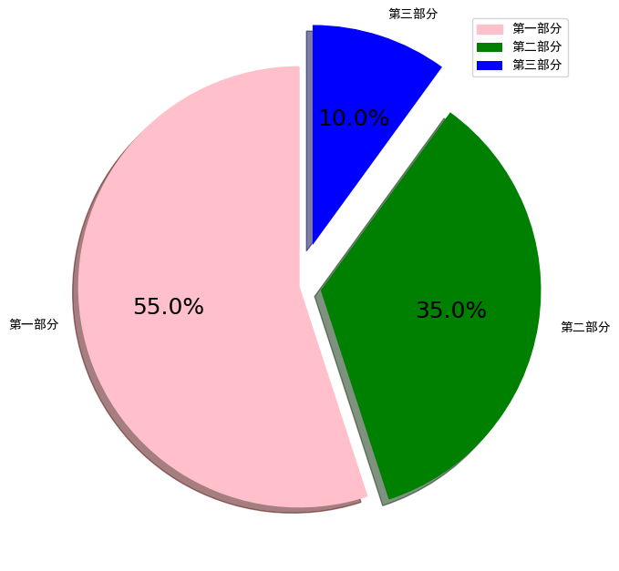
饼图:用于表示不同分类的占比情况,通过弧度大小来对比各种分类。
特点:分类数据的占比情况
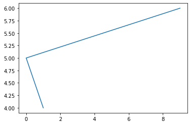
4、 Matplotlib画图的简单实现
1 | # 导入 |
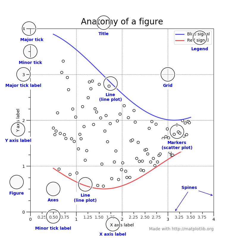
5、对Matplotlib 图像的认识
6、折线图
6.1 折线图的绘制
1 | from matplotlib import pyplot as plt |
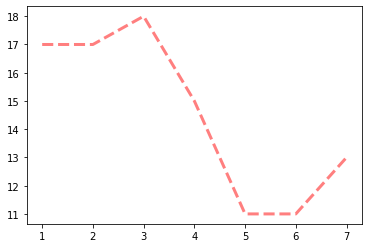
6.2 折线的颜色和形状设置
1 | from matplotlib import pyplot as plt |
6.3 折点样式
1 | from matplotlib import pyplot as plt |
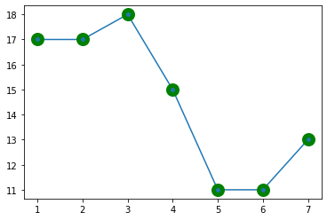
折点形状选择
| character | description |
|---|---|
| ‘-‘ | solid line style |
| ‘–’ | dashed line style |
| ‘-.’ | dash-dot line style |
| ‘:’ | dotted line style |
| ‘.’ | point marker |
| ‘,’ | pixel marker |
| ‘o’ | circle marker |
| ‘v’ | triangle_down marker |
| ‘^’ | triangle_up marker |
| ‘<’ | triangle_left marker |
| ‘>’ | triangle_right marker |
| ‘1’ | tri_down marker |
| ‘2’ | tri_up marker |
| ‘3’ | tri_left marker |
| ‘4’ | tri_right marker |
| ‘s’ | square marker |
| ‘p’ | pentagon marker |
| ‘*’ | star marker |
| ‘h’ | hexagon1 marker |
| ‘H’ | hexagon2 marker |
| ‘+’ | plus marker |
| ‘x’ | x marker |
| ‘D’ | diamond marker |
| ‘d’ | thin_diamond marker |
| ‘|’ | vline marker |
| ‘_’ | hline marker |
主刻度次刻度
1 | from matplotlib import pyplot as plt |
1 | # 刻度朝向 |
1 | # 选择主次刻度 |
1 | # 修改刻度长度 |
1 | 
6.4 设置图片大小和保存
1 | 
6.5 绘制x轴和y轴的刻度
1 | 
6.6 设置显示中文
1 | 
6.7 一线多图
1 | 
6.8 一图多坐标系子图
1 | import matplotlib.pyplot as plt |
6.9 设置坐标轴范围
1 | # 设置坐标轴范围 |
6.10 改变坐标轴的默认显示方式
1 | import matplotlib.pyplot as plt |
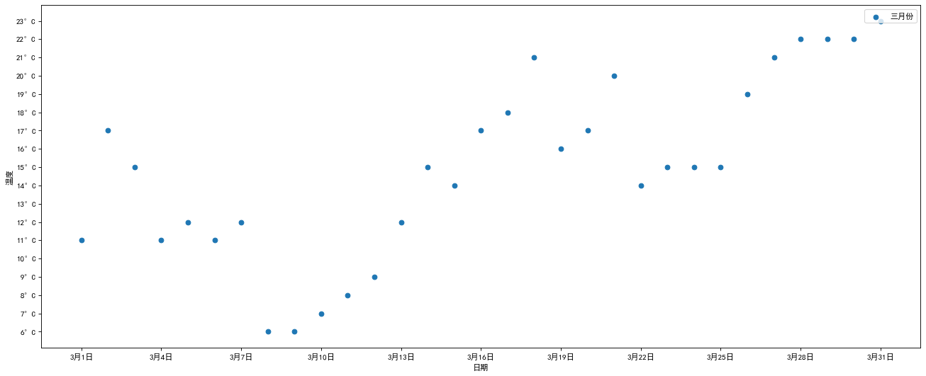
7、绘制散点图
1 | ''' |
8、 绘制条形图
1 | ''' |
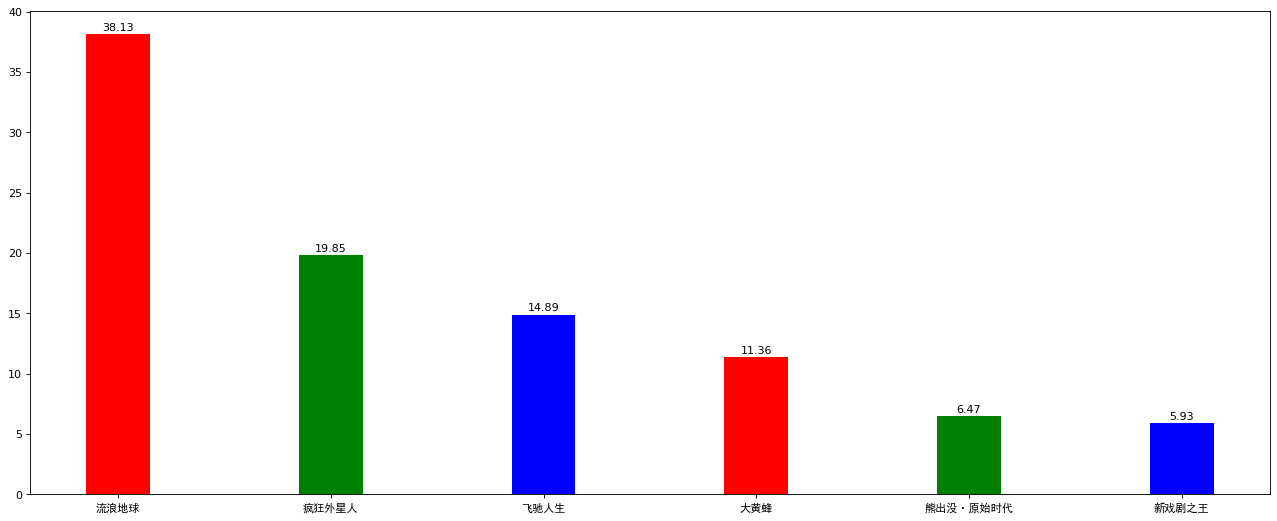
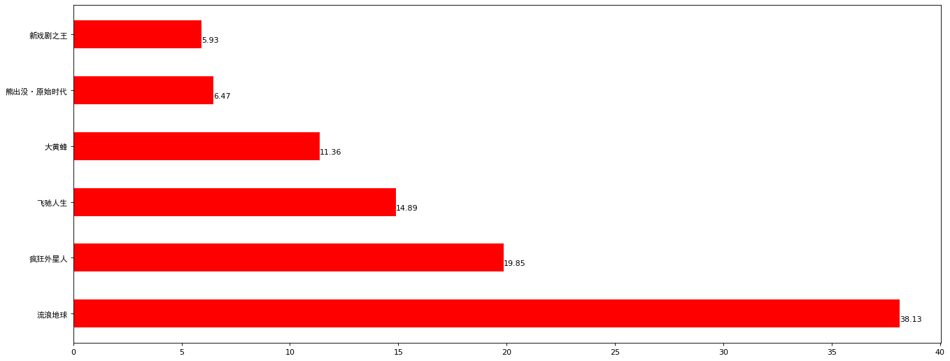
横向条形图
1 | from matplotlib import pyplot as plt |
并列罗列条形图
1 | 
9、直方图
1 | from matplotlib import pyplot as plt |
10、饼图
1 | from matplotlib import pyplot as plt |
11、百度echarts、pyecharts
Pyecharts 渲染效果更好,交互式的 html 文件。但是目前版本还不是很稳定,且生成的html 文件不是很好利用到学术写作。以后再学习。展示一个官方示例,不然我的小破站扛不住。此外还有数据分析常用的可视化工具 tableau ,有缘在学习。
3D曲面图
1 | import math |
感谢您的阅读,本文由 LEE 版权所有。如若转载,请注明出处:LEE(https://ChubbyLEE-Math.github.io/2020/07/11/Python%20Matplotlib/)